Dare to be EXPRESSIVE

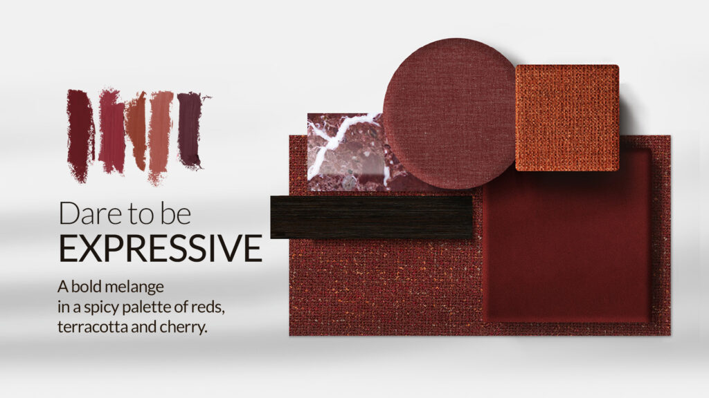
The Colour Bravery trend is about fearless use of colour and texture — intentional, emotional, and uncompromising. It marks the return of saturated tones and multicolour textures that bring emotional depth to a space.
The FABB brand presents a collection that redefines the role of colour in interiors.
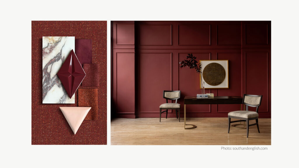
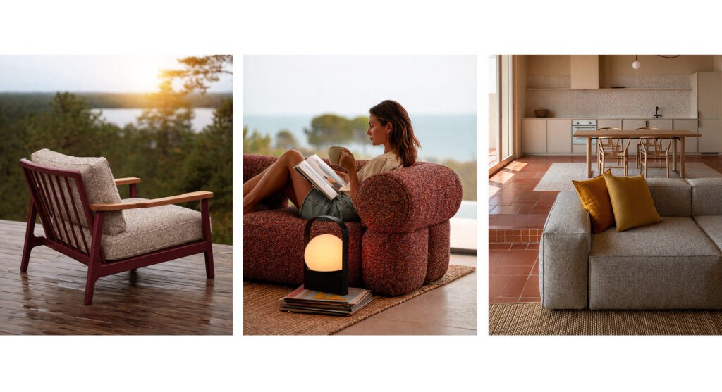
At the centre of this story is Hevre – a multi-tonal, balanced mélange combining terracotta, red wine and muted yellows. It is a colour inspired by craftsmanship – like a hand-woven texture, full of depth and nuance.
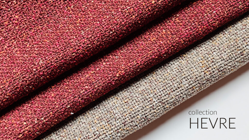
Hevre gains even more character in good company. Terracotta Noelle highlights its spice-like warmth, while dark-coral Lins, together with Hogan, create a cohesive and confident backdrop. Burgundy – deep, pigment-rich and saturated – works beautifully both on a light base and when paired with dark pink, aubergine or warm terracotta. In such contrast it gains energy and clarity.
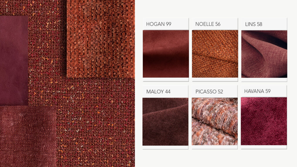
Contemporary design trends show a clear shift toward warm, spice-inspired tones: sienna, mineral reds, burgundies with brown undertones, and colours inspired by ceramics and natural pigments. Hevre brings these tones together in a structural mélange, while terracotta Noelle softens the composition alongside the cherry-toned suede of Hogan.
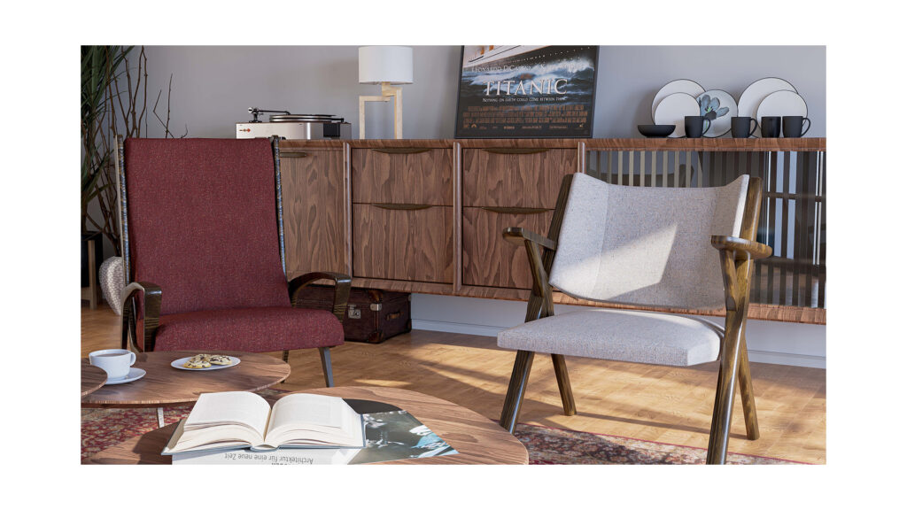
The key to working with these colours lies in the right light and energetic accents: greenery, brass, warm wood tones or handcrafted ceramics.
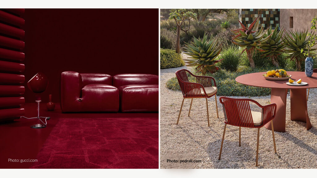
Leading furniture brands are following the same colour direction:
- Gucci introduced a series of furniture pieces in its debut collection in the rich shade of “Ancora Red” – a deep red tone that reinterprets classic design forms.
- Pedrali has incorporated burgundy chairs and seating into its collections, aligning with the trend of intense reds.
- Magis presented sideboards and furniture accents in expressive red, combining bold colour with innovative materials.
- Scandinavian brands such as Bolia and Woud increasingly use shades of burgundy, bordeaux and deep red in their ranges, giving furniture a distinctive and elegant accent.
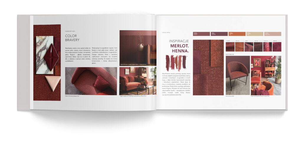
COLOUR AS A DECISION.
The PANTONE palette is the foundation of the composition.
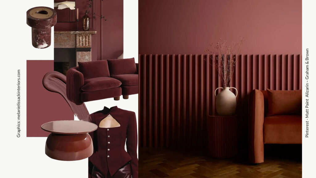
The project is built on a carefully composed, spice-inspired PANTONE colour sequence that creates the emotional narrative of the interior:
- Pantone 19-1532 TPG Rosewood – a deep, smoky shade of red wood. It introduces elegance and a sense of maturity. A colour of structure that beautifully enhances the multi-tonal character of Hevre.
- Pantone 19-1524 TCX Oxblood Red – a saturated burgundy with strong pigment intensity. It adds boldness and a luxurious tone to the project, perfect for strong upholstery accents.
- Pantone 18-1248 TCX Rust – a warm, mineral rust inspired by ceramics and natural pigments. It brings organic energy and a crafted, artisanal feel.
- Pantone 14-1118 TCX Beige – a balancing base. It calms the composition and allows the intense tones to stand out without overwhelming the space.
- Pantone 15-1511 TPG Mahogany Rose – a muted warm pink with a hint of brown. It connects burgundy with terracotta, adding softness and a subtle suede-like effect to the palette.
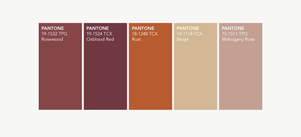
This palette works like a spice blend – each color has its own role, but only together do they create the full composition. Deep reds and rusty terracotta tones build emotion, beige stabilizes the arrangement, while mahogany rose introduces a contemporary twist.
In projects using FABB fabrics, PANTONE colors become a tool for intentional design. They allow architects and interior designers to build contrasts precisely, plan light interactions and combine textures in a way that highlights the crafted character of the collection.